- Words to the Wise
- Posts
- When Bad Metrics Happen to Good People
When Bad Metrics Happen to Good People
People say numbers don’t lie. Experience teaches that they don’t tell the whole truth, either. This makes them a lot like words.
Steve Sampson
May 12, 2025
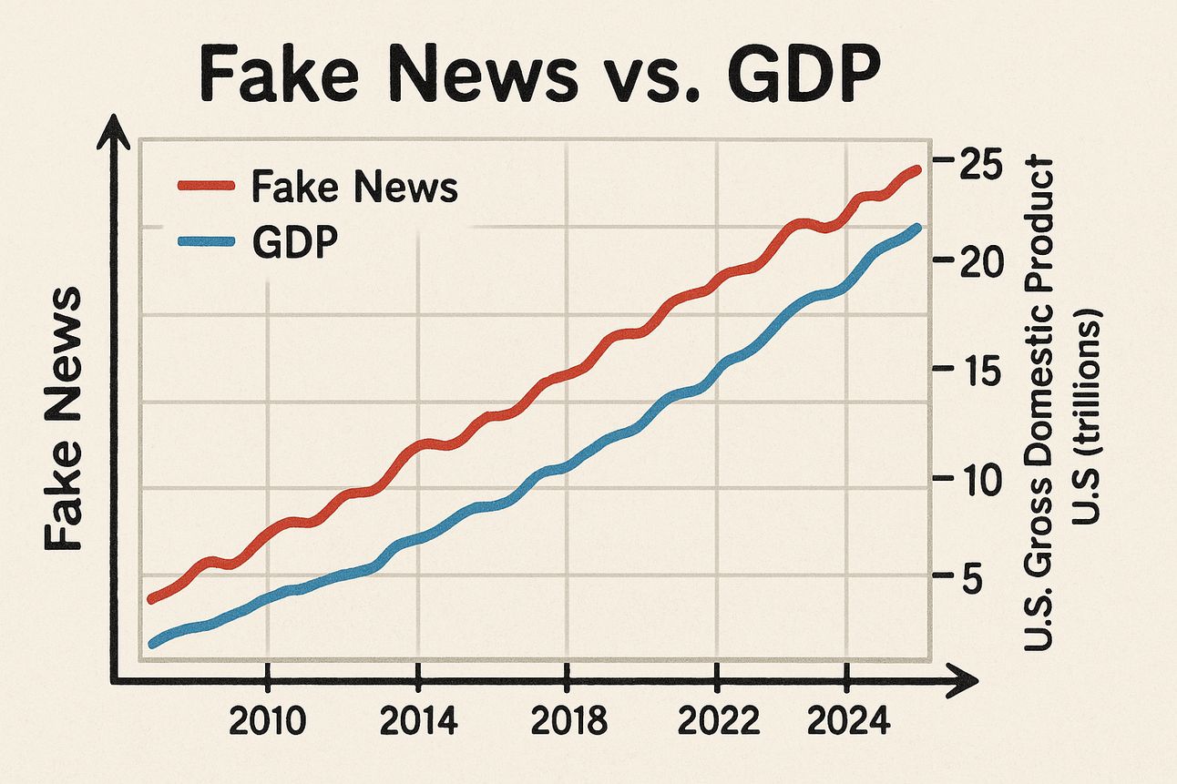
This is fake news about fake news—in a phony graph of a
fake correlation that still may have made you look.
Friends,
Back in 1999, I worked at a dot-com startup that helped invent the email newsletter. At its core, the company was a direct marketing shop, with leaders who had come from the telemarketing and direct mail industries.
We were no slouches at email: While there, I ran the team that produced the official email newsletter of the Sydney 2000 Olympic Games.
With a direct marketing mindset and dotcom aspirations for world domination, we also focused deeply on data. Compared to what’s possible today, what we did to track performance back then was rudimentary. But we had all the rudiments in place, which is always 90 percent of the battle.
We also did a lot of silly things that I’ve since seen others repeat dozens of times. Many of these involved treating our data as timeless, incontestable, and native to a metaphysical plane that transcended ordinary human contexts.
It’s the Most Wonderful Time of the Year
Once, a C-Suite executive of ours went ga-ga over an engagement tracking report. Thrilled that we had achieved an all-time revenue high during a two-day period, he organized a task force to determine how to replicate the results.
He failed to note that the two-day high had occurred on December 20th and 21st and coincided with a special last-minute holiday shopping email that we had blasted to millions of people. That special email contained last-minute gift ideas, coupled with Christmas-themed coupons and special offers.
It didn’t take an ad wizard—or a task force—to determine why we had suddenly driven more revenue on those days. It just took awareness of the crucial contextual fact that many people buy last-minute gifts in the days before Christmas.
If You See it in a Spreadsheet, It’s True!
There was no real possibility of us replicating our revenue performance from those days. We didn’t have permission from our subscribers to email them offers that frequently, our advertisers weren’t running last-minute holiday shopping deals year-round, and most days just aren’t the final shopping days before Christmas.
Nevertheless, our intrepid executive insisted that the decontextualized data proved that such revenue performance was possible and argued that we should set future daily targets accordingly. His rationale was simple: the numbers in the spreadsheet weren’t lying.
This was an instance of someone making a “data-driven” decision that was also profoundly dumb. On the bright side, it led me to an important discovery. As I searched for an effective counter to the notion that we should set impossible targets based on last-minute Christmas coupons, I discovered a ballast against bad data-driven decision-making that I’ve used ever since: the McNamara fallacy.
Lesson Learned:
What the Data Don’t Know Can Hurt You
The McNamara fallacy, also known as the Quantitative Fallacy, warns against exclusive reliance on quantitative data for decision-making. It’s named after Robert McNamara, the U.S. Secretary of Defense during the Vietnam War, who made some historically bad decisions. The fallacy unfolds in four stages:
Stage 1. You measure what’s easy to measure—clicks, steps, calories, etc.
Stage 2. You disregard what’s not easy to measure and lose sight of the ultimate goal—human engagement (not clicks), cardiovascular health (not steps), long-term nutritional benefits (not calories), etc.
Stage 3. You start to assume, maybe just implicitly, that what isn’t easy to measure isn’t all that important. This is like thinking that Christmas doesn’t matter.
Stage 4. Eventually, you convince yourself that what can’t be easily measured isn’t real. This is off-the-deep-end crazy, like assuming that a road that isn’t on a map must not exist.
While the perils of moving from “let’s measure something simple” to “let’s assume that what we measured is all there is” should be clear, experience suggests that people make this trip pretty regularly. Here are just a few ways that the McNamara fallacy is arguably warping our world today:
Healthcare: Focusing solely on patient throughput, hospitals prioritize quick discharges over care quality, and patients suffer.
Education: Emphasizing standardized test scores, schools disregard critical aspects of education like creativity, critical thinking, and emotional development, and children suffer.
Business: Constantly prioritizing short-term financial metrics over sustainability considerations, businesses burn out people and burn up the planet.
Public Policy: Relying on GDP as the overriding measure of national well-being, policymakers downplay income inequality, health, education, environmental sustainability, and human happiness.
Artificial Intelligence: Believing that we can create omniscient artificial beings, we feed huge digitized datasets to LLMs and ask them to make sense of our messiness for us.
Why do people succumb to the McNamara fallacy? I doubt there’s a single, simple explanation. But part of the problem is surely that people need rationalizations as often as we need actual reasons, and “hard numbers” feel like solid ground to stand on.
Quantitative data offer an illusion of complete control and objectivity in a world of uncertainty. Numbers don’t just inform decisions; they shield decision-makers from criticism and uncomfortable ambiguities. It’s easier to say “the data made me do it” than to grapple with messy realities that can’t be reduced to the neat ontological boundaries of a spreadsheet.
Practicing Healthy Data Skepticism
In their book Calling Bullshit: The Art of Skepticism in a Data-Driven World, Carl Bergstrom and Jevin West argue that we desperately need to develop a critical eye for how data can be manipulated or misinterpreted—and be ready to call BS when people use numbers badly.
They reserve their harshest criticism for what they call “new-school bullshit,” which “uses the language of math and science and statistics to create the impression of rigor and accuracy.” Directly addressing the fact that metrics can easily mislead us, they argue for healthy data skepticism, including the ability to spot and debunk “new school bullshit.”
The point isn’t to reject metrics. That would be a different sort of BS. The point is to ask good questions about them: What are they supposed to indicate (and do they)? What do they not measure? Would the conclusions we draw from them hold in different contexts? What external cultural or human factors might explain the patterns we’re seeing? Are we mistaking correlation for causation (GDP and fake news have both been growing … )? What else might we be missing?
My experience with that overzealous C-Suite executive taught me that the most dangerous aspect of “metrics-driven” thinking isn’t the data per se, it’s the false confidence that “having the data” can inspire. Data points are rarely bare facts. More often, they’re artifacts of measurement choices, collection methods, and interpretive frameworks. When we forget this, we risk making spectacularly wrong decisions with what we think is unquestionable evidence—or, worse, having our machines do it for us.
In a world increasingly governed by algorithms and analytics, sometimes the most valuable skill is knowing when to trust your human judgment over a decontextualized data point. The numbers may not lie, but they rarely tell the whole truth, either.
What can we do to guard against misleading metrics? For one thing, read Bergstrom and West’s book. For another, try the trick below for thinking critically about any metrics, dashboards, or reports you rely on.
Tricks to Try: What’s Missing from the Metric?
For any report or dashboard you rely on, ask these five essential questions about each metric:
What is this metric really measuring?
Is it a true indicator of success or just a proxy for something more complex?
Example: A tally of “pageviews” may measure exposure but not reflect meaningful engagement.
What important factors are unmeasured or missing?
What human, qualitative, or long-term outcomes aren’t captured?
Example: Are we measuring donations but not donor engagement or retention?
What behaviors does this metric incentivize, intentionally or not?
If we maximize this number at all costs, what unintended consequences could follow?
Example: Optimizing for “tickets closed” might lead tech support to rush to short-term fixes.
How context-dependent is this metric?
Is this number affected by seasonal patterns, external factors, or time-sensitive trends?
Example: It was Christmas!
What would success look like if this metric didn’t exist?
Can we clearly articulate what “better” looks like without referring to this number at all?
Example: How would we define engagement if we couldn’t track opens?
Final Reflection:
Which metrics are giving you a false sense of clarity?
What’s your most important “unmeasured truth” right now?
What are some imperfect proxies for the latter? Should we be using these as metrics?
Why This Works:
Metrics simplify reality. Simplification is necessary, but it always means leaving something out. This exercise forces you to ask whether what you’re missing could be more important than what you’re measuring.
Final Thought: No Bob Is Just a Mammal
There’s a sense in which metrics are a lot like words, especially common nouns.
Metrics simplify reality by categorizing its contents and counting specific examples. In so doing, they ignore the specificity of the examples they count: metrics almost always disregard what’s unique about particular instances and focus on what’s similar, shared, or generalizable.
Common nouns do something similar. I can describe the same creature as an animal, a mammal, a dog, an Italian Spinone, or Bob, the furry friend sitting at my feet right now. Any of these descriptions would be accurate. None would be the full story. Any could be useful for a particular purpose or context. Only one—“Bob”—even attempts to recognize a unique individual.
Numbers don’t lie. But then, neither do words. It’s what humans do with either that makes them true or false, helpful or hurtful, revealing or deceitful. If you want to help create shared understanding, you have to learn to use both wisely and avoid being misled by either.
You can start by remembering that no Bob is just a mammal. Here’s a picture of my Bob to prove it …

Immeasurably adorable, isn’t he?
Best,
Steve
Steve Sampson has more than 20 years of experience as a communications executive, content creator, editor, writer, and team builder. As founder and chief wordsmith at Better Word Partners, his mission is to help other mission-focused leaders find better words, stories, and arguments to achieve their goals.